


TennisPAL App Redesign

Role
Product Designer

Context
Skills
TennisPAL is a tennis community app designed to promote members to utilize the unused tennis courts in the users area booking casual games as well as promoting users to engage with other like-minded tennis players or coaches. Users can book games, play, teach or learn tennis, in-person or virtually. Users can reserve a court anywhere!
Problem
UX Research
Interaction Design
Prototyping
App Conception
Graphic Design
Brand Design
While TennisPAL aims to serve the tennis community well, user research and hands-on testing revealed several UX challenges. Users reported confusion due to an inconsistent interface, unclear navigation flows, and a lack of focused functionality. The app attempts to address too many user needs at once, resulting in diluted user journeys. Additionally, there are limited niche filtering options and minimal UX-driven features that encourage meaningful user connection.
User Research
4 Weeks
To ground the redesign of TennisPAL in real user needs, I conducted user research with a diverse group of 20 participants, ages 18 to 56, all of whom had interacted with the app in some form. Through a combination of surveys and interviews, I surfaced key pain points and opportunities, broken down below into quantitative trends and qualitative insights.
Quantitative Insights
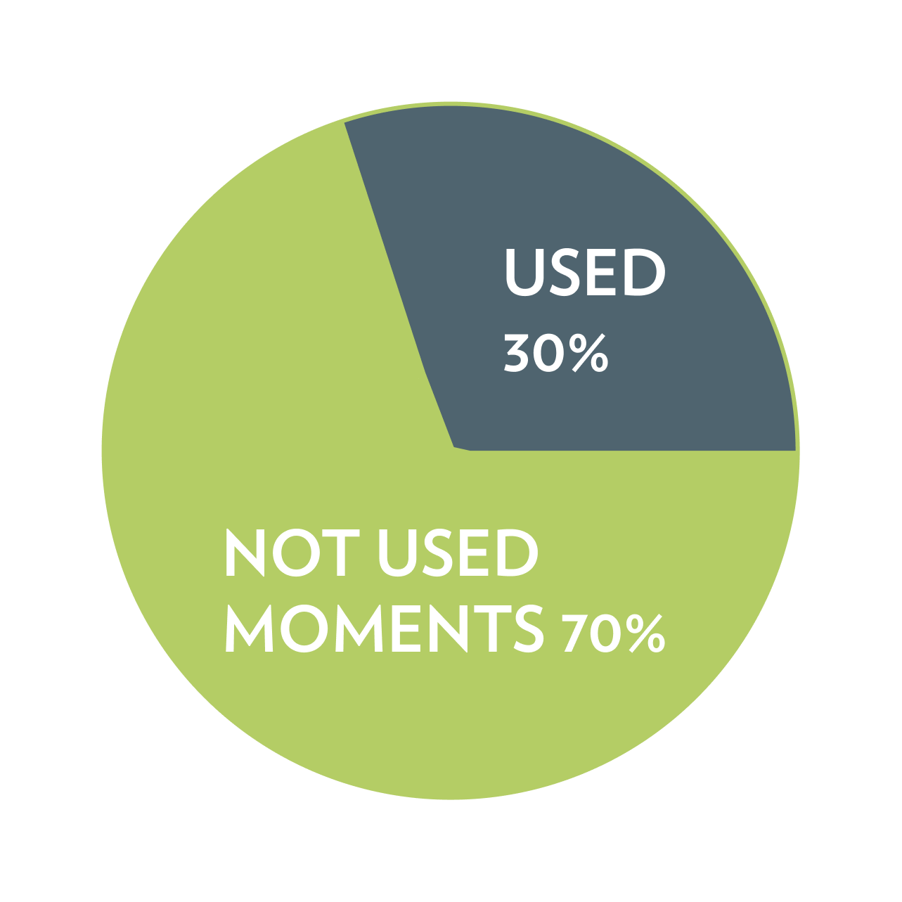
70% of users did not use or care about the “Moments” feature → It was seen as irrelevant to their core task of booking or connecting.
Tools
60% of users ages 18–35 said they wanted to reach out to coaches but felt hesitant due to a lack of ratings, reviews, and trust signals.
45% of users aged 18–25 wanted more filtering options when browsing players.
"There’s no way to find someone specific — it's just a scroll fest.”65% expressed frustration that users and coaches appear inactive, leading to confusion about who to reach out to.

Flowchart

Prototype

Coach Page
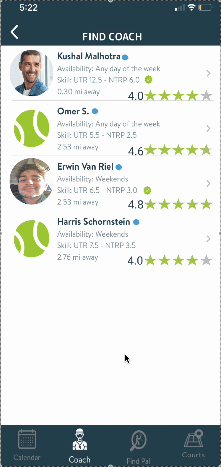
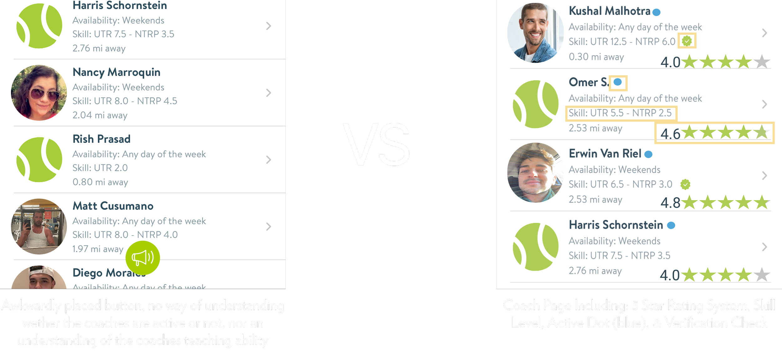
The “Find Coaches” page was redesigned to foster greater trust and improve usability. A rating system was introduced, allowing users to share feedback on their coaching experiences, helping others both feel more confident when booking and find coaches aligned with their learning style. Active indicators (blue circles next to coach names) were added to show recent activity, addressing a key pain point uncovered in user research: many users reported sending messages and receiving no response. This visual cue helps users make more informed choices about whom to contact. Additionally, the removal of the prominent green button at the bottom of the screen created a more intuitive, streamlined interface.

Profile Page
Motion
Promo
Figma
Figjam
Adobe Creative Suite
The goal of these prototypes was to translate user research insights directly into design improvements. The focus was on refining the app’s most-used core interactions simplifying the experience rather than adding unnecessary features. This included removing the redundant Moments tab, making targeted UI adjustments such as relocating the search icon for better accessibility, and adding filters to streamline user searches. The core belief behind these changes is that TennisPAL should help users quickly connect with players, coaches, and courts enabling fast, intentional interactions so they can spend less time navigating the app and more time on the court.
The goal of this redesign was to make the Coach Profile page more trustworthy, intuitive, and user-friendly. Based on user research, I focused on improving information hierarchy and reducing friction in the booking flow. Key changes included adding a rating system and activity indicators to help users feel more confident when selecting a coach, introducing a cleaner layout with clear sections and icons for better readability, and giving coaches space to personalize their profiles with descriptions and social proof (such as Instagram links). I also removed distracting UI elements, like the bottom navigation bar, to create a more focused and streamlined experience, ultimately making it easier for users to connect with coaches and book sessions quickly.

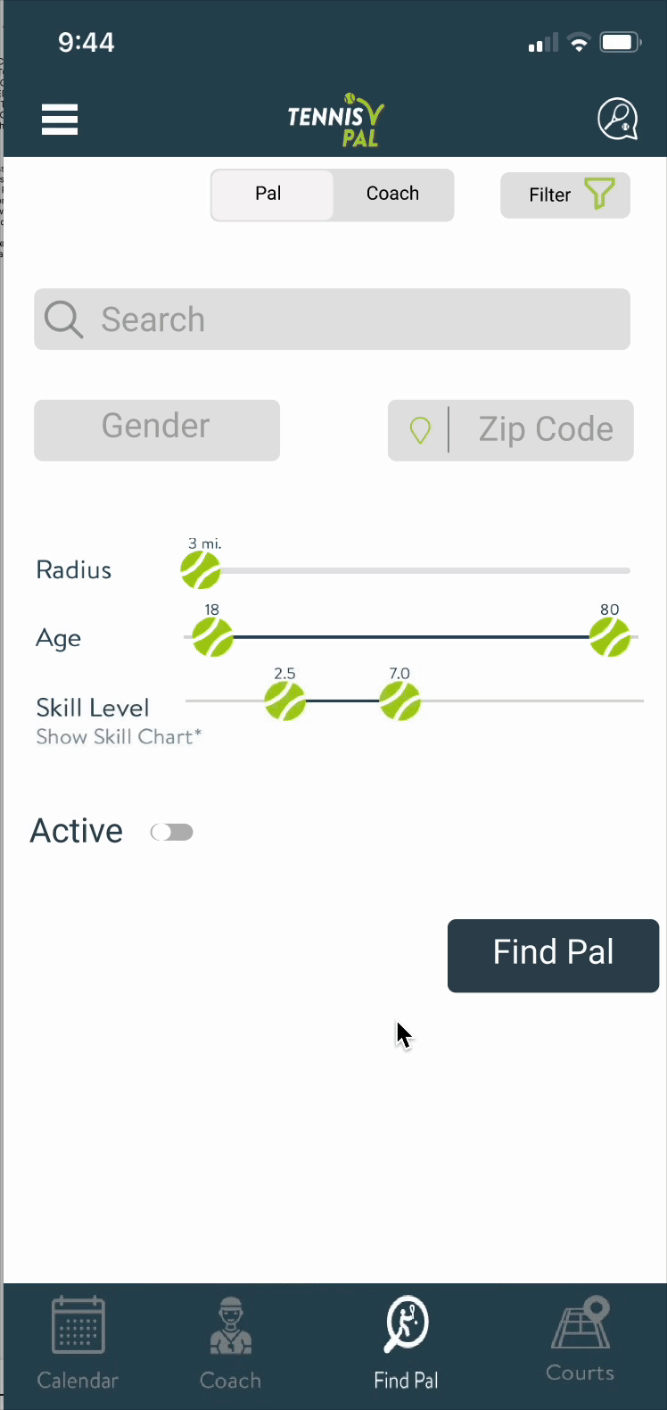
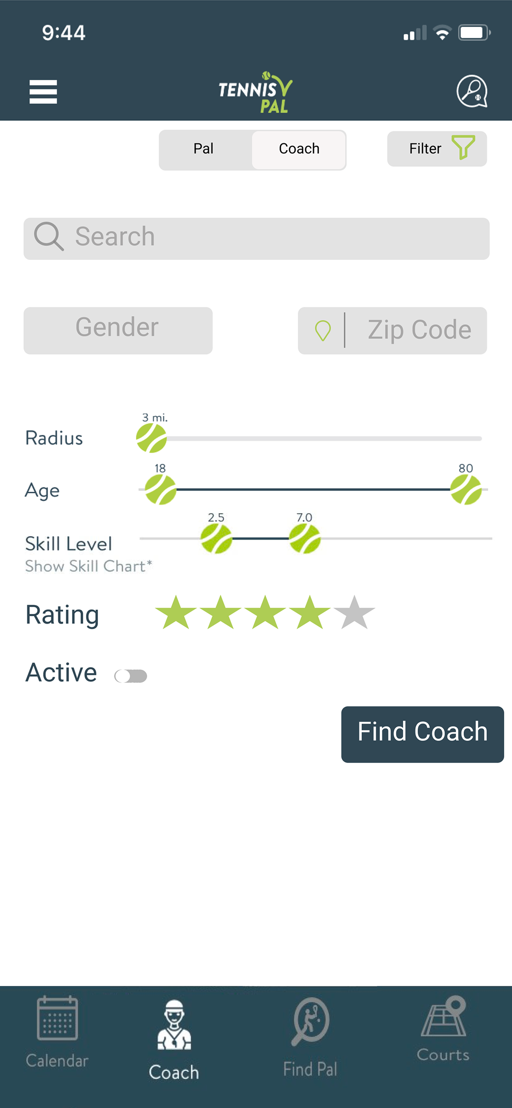
Pal / Coach Search
The goal of the Search page redesign was to provide users with more precise and useful filtering options for finding the right match. Key enhancements included adding a rating system, recent activity indicators, distance visibility, and skill level all essential elements to help users make faster, more informed decisions and create a more streamlined, personalized search experience.
Timeline


Design Kit

Goal
The primary goal of the TennisPAL redesign was to retain and refine its core functionality, streamlining the user experience by focusing on what users truly valued. The existing app offered five main areas:
Calendar (to schedule matches or training),
Coach (connect with tennis coaches),
Pals (find and message other players),
Courts (reserve local tennis courts), and
Moments (a social feed similar to Instagram).
Through user research and personal UX evaluation, it became clear that while the app had a strong foundation, its value was diluted by unnecessary or underperforming features, most notably the Moments feed. Although originally intended to give users a social outlet, the Instagram-like feed didn’t align with users' primary motivations: connecting with other players, finding coaches, and securing court time. As a result, one of the core redesign decisions was to remove the Moments feature and shift focus back to what was working well:

Refocus and Feature Enhancement
The redesign emphasized clarity, relevance, and utility:
Active Status Indicators: A common frustration surfaced when users tried to connect but received no responses. To reduce dead-end interactions, I introduced a feature showing when a user was last active (e.g., "Active 2 days ago"). This visibility empowers users to make informed decisions about who to contact.
Skill Level and Ranking System: Users expressed a desire to better understand the skill level of potential partners. I introduced a ranking system based on common tennis metrics (e.g., 3.4 = intermediate, training with a coach; 5.6 = competitive, above average). This system encourages transparency and compatibility.
Coach Rating System: Trust plays a huge role in selecting a coach. To support that, I designed a five-star rating system so users could share feedback and future users could make more confident choices.
Advanced Search Filters: The original search functionality was broad and lacked precision. I redesigned it to support niche filters, enabling users to search with greater intent—e.g., “Players at 7.6 level within 3 miles who’ve been active in the last 2 weeks.”
Strategic Design Focus
This redesign wasn’t about adding more, but about doing more with less. By eliminating underused features and elevating those that directly supported TennisPAL’s core use cases—connection, coaching, and court access—the user experience became more intuitive, actionable, and engaging. The result is a cleaner, smarter platform that speaks directly to the needs of the tennis community.
The ultimate goal of this redesign was to eliminate unnecessary features from the earlier version and focus on enhancing the app’s most popular and familiar core functions. The aim was to create a more streamlined, intuitive experience allowing users to engage with the app effortlessly and spend more time focusing on the game itself, rather than navigating the interface.